Device as Sculpture
Jony Ive's design aesthetic is fundamentally sculptural, not ergonomic: he makes objects to be beheld, not to be held. Following the passing of Steve Jobs in 2011, there really wasn't anyone at the company to rein him in.

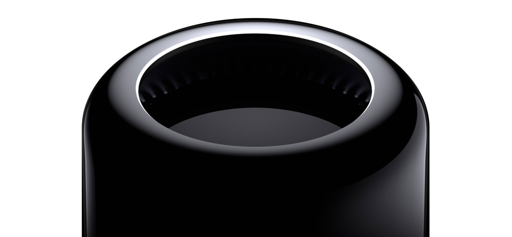
Yesterday Apple announced, via a handful of tech reporters it trusts, that it is completely redesigning the Mac Pro. This is unusual for Apple, which typically "announces" products by releasing them, but that isn't my concern here. In its round-table with the reporters, Apple admitted that it had designed itself into a corner, constrained by the thermal envelope of the Darth Trashcan.
How did this happen?
Apple has been making desktop computers for almost 40 years, and professional workstations in particular for over 25 (Quadra, PowerMac, Mac Pro). I remember the launch materials for the PowerMac G5 detailing the case's distinct thermal zones and passive airflow to allow for quiet, cool performance. How did they miss the boat on the evolution of thermal requirements in professional workstations so badly in just a four-year window? What's worse, this was not some unexpected development. If anything, Apple's bet on a shift toward highly parallel GPU workloads, able to scale across multiple GPUs, was the real gamble: it required developers do custom work for OpenGL programs, or use OpenCL, neither particularly likely in a world of performance applications dominated by Windows and Nvidia (and thus CUDA).
As confounding as the significantly constrained thermal headroom was the lack of extendability and expansion, with no additional storage and no PCI slots for custom components. Instead it called for the use of large amounts of external cabling via Thunderbolt. Thunderbolt can boast some impressive transfer speeds, but they didn't necessarily beat ISA lanes to PCI slots or SATA, and came at a huge cost premium.
Given the range of constraints that define professional workstations, the Late 2013 Mac Pro is what you might arrive at if you first determine that your must-have is compact form factor.
I have a theory.
I've been sitting on it for a while, teasing it here and there, but hesitant to publish it (until now) because, frankly, I've been unprepared to deal with the backlash.
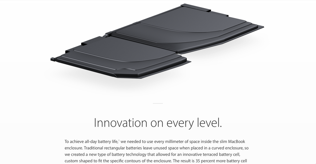
It's a good theory, though, and it explains so many puzzling design features in Apple hardware across its product lines over the past 5 years, from the scalloped battery in the original 12-inch MacBook…
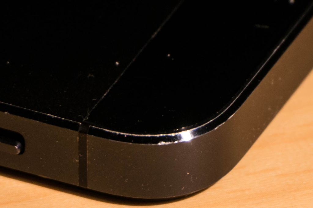
…to the extremely hand-unfriendly (IMO) edges on the iPhone 5…
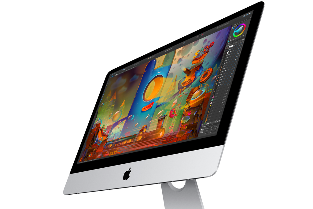
…to the focus on thinness behind the panel on the iMac, necessitating its unsightly bulge.
My theory is that Jony Ive's design aesthetic is fundamentally sculptural, not ergonomic: that he makes objects to be beheld, not to be held. And that following the passing of Steve Jobs in 2011, there really wasn't anyone at the company to rein him back in favor of other considerations.
Let me back up. Ive's sculptural bent is not new, and has been a powerful asset for Apple over the years. Ive's first assignment at Apple was the original iMac, which radically changed the way personal computers were packaged, presented and marketed.
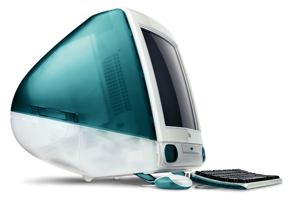
This machine was an immediate sensation, and in the eyes of many observers helped turn Apple's fortunes around. It also came with this mouse:
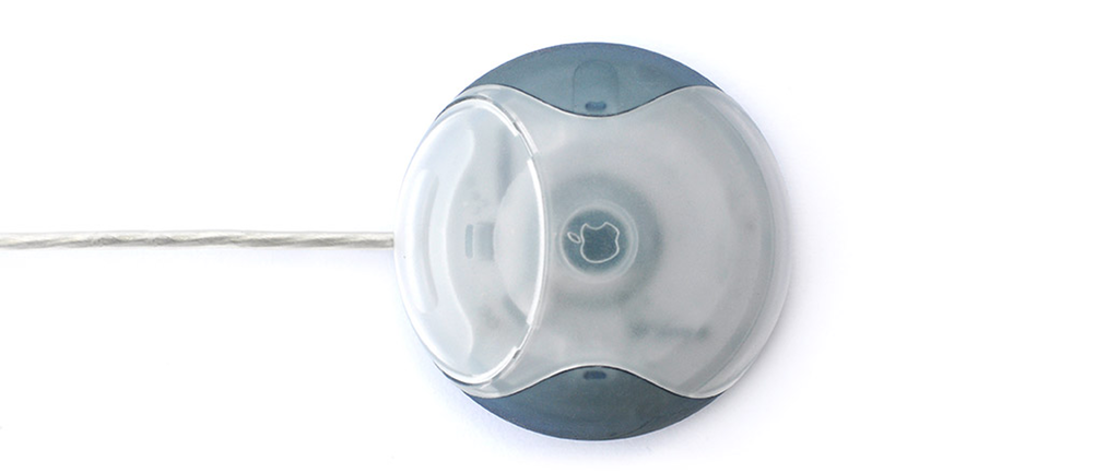
Right from the start, the object designed to be placed and beheld receives a disproportionate amount of design attention. The object designed to be held and manipulated is designed not for its purpose, but for presentation and observation.
Before this USB Mouse, better known as the "Hockey Puck," Apple had pretty decent mice. Every Apple mouse since this one has been terrible, disregarding the shape and geometry of the human hand—but they're all undeniably beautiful, museum pieces even. Fortunately, the Magic Trackpad is a superior input device in nearly every way, so the fact that Apple hasn't made a single decent mouse in 25 years can be ignored.
In a way, the sculptural theory explains even the messiness of the Ive-led iOS 7 redesign, with oft-unreadable fonts, indecipherable glyphs replacing clear icons, and lost affordances everywhere. ("Who needs outlines to clearly indicate what is a button and what is text, or whether a toggle is depressed or not!") The aesthetics of display trumped the pragmatic concerns of interaction and use, especially for a designer who was expanding into a new area.
The Late 2013 Mac Pro was the first really big post-Jobs product redesign. 2012 had given us the first MacBook Pro with Retina Display, but the enclosure was an iteration of the design language already firmly in place, a cross between the MacBook Air and the preceding MacBook Pro. It was the Mac Pro that was a "blank canvas" product iteration, and it was a visual stunner, but if you really think about it, it was also the epitome of this device-as-sculpture problem. Its case was polished such that merely touching it covered it in fingerprint smudges (for a device that depended on external peripherals for extendability).
I have felt, over the past two years, that Jony has lost interest at Apple, delegating more and more of his responsibilities and disinterestedly narrating videos from within a white room (or not even appearing on camera!) for WWDC keynotes. Perhaps he's been hard at work on a final hurrah in the form of the 10th-year anniversary iPhone, due this Fall, or some other top-secret (Car?) project.
There was a haphazardness to the recent MacBook Pro with TouchBar, especially in the size of the trackpad starting to eliminate wrist rest space, and a third straight year of the same iPhone 6 "lozenge."
Even the Watch suggests a measure of design disinterest, or sculpture over ergonomics, looking as it does like a miniature iPhone 6 with a strap attached. Every time I look at it, I find it so completely divorced from the aesthetics of the human body. It's fascinating.
I'm hoping this Mac Pro reset represents a rebalancing of input constraints within Apple, and hoping it carries over to other product lines simply because it means even better results.
As for Jony Ive, I think he's done. I could be wrong, but it looks like it's time to move on. So long, and thanks for all the hits!